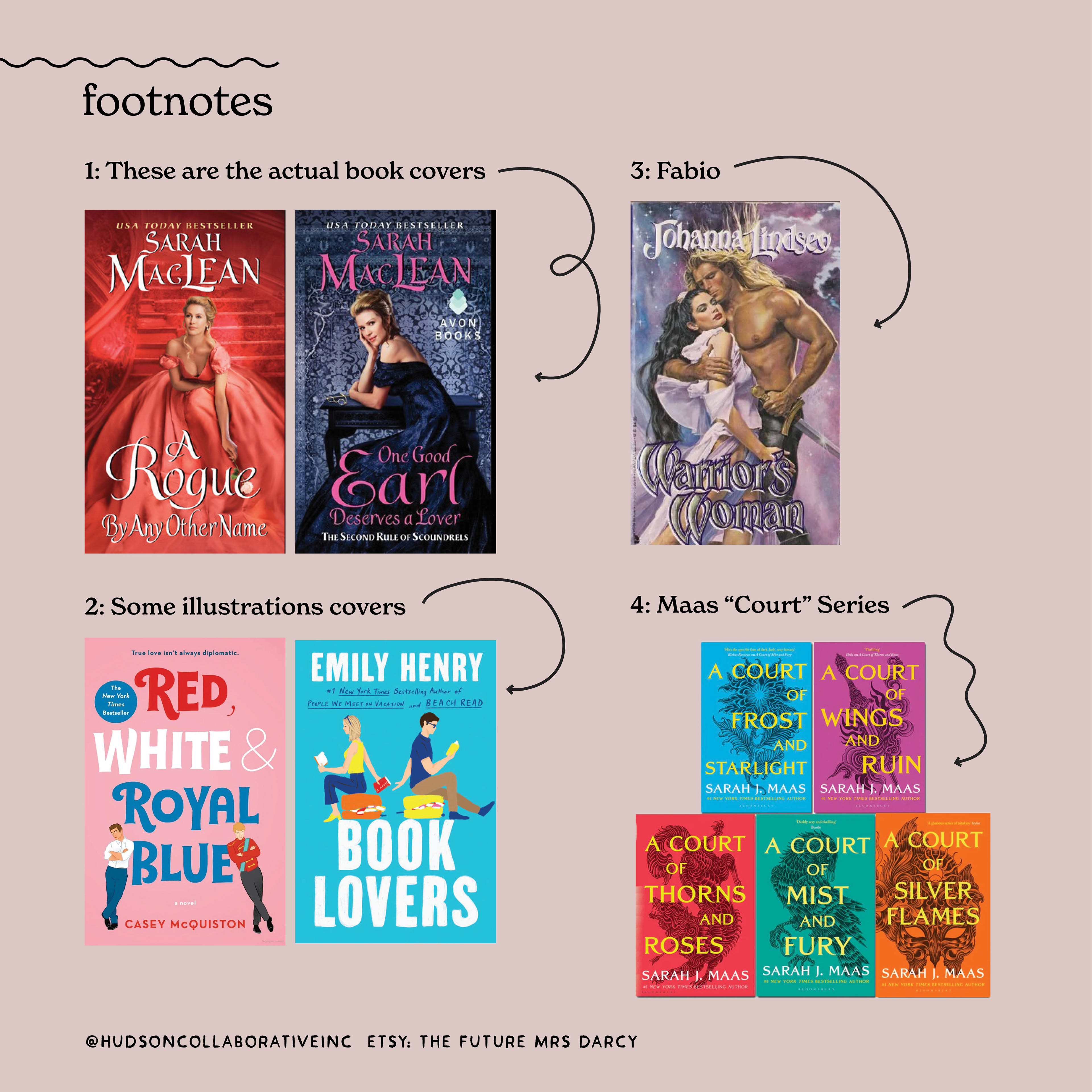
Romance novel re-designs. I cannot tell a short story to save my life so the TL;DR of this is that I found this book series that I love by Sarah Maclean but have this thing about how most romance covers are either bodice forward(1) or a very particular illustration style(2) so I made new covers. (Footnotes below)
The not short version is that I love to read. I will read Serious BooksTM (and have nightmares for months about being a spy in Nazi occupied France) but in the end I will always head back to romance. And while *I* don't judge a book by its cover, I do feel majorly judged reading something with Fabio(3) daring strangers to make eye contact.
There are exceptions to the rule but most books have busty babes or, lately, light hearted illustrations. I have done no research but I am guessing that the books that are exceptions such as Sarah Maas' Court series(4) get a bump in readership because the covers were less overt.
I'm not throwing any shade on the computer artists that create the composites for the covers that are now largely Fabio-less or the illustrators--they do AMAZING WORK! But Pippa in "One Good Earl Deserves a Lover" has 1800's glasses. Let's take a moment to realize how unsexy those probably were. None of these heroines are 80's hairband groupies with crazy volume and a perfect smokey eye.
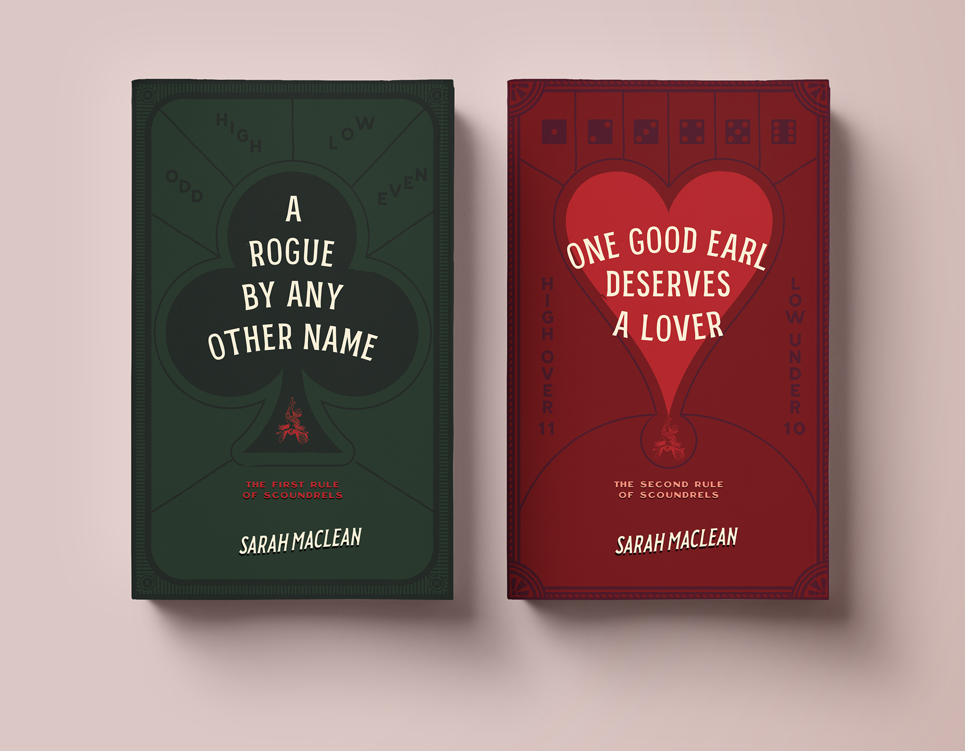
These books all have a gaming aspect and the author does a great job describing the characters so let's focus on the former and let her do the latter.
(Also there are 4 books in the series but I am at the mercy of my library queue so I've only read the first two. 😉 I may need to switch the heart for a diamond to save that for #4 and then it would go clubs, diamonds, spades, hearts which is bridge ranking but we shall see).
The not short version is that I love to read. I will read Serious BooksTM (and have nightmares for months about being a spy in Nazi occupied France) but in the end I will always head back to romance. And while *I* don't judge a book by its cover, I do feel majorly judged reading something with Fabio(3) daring strangers to make eye contact.
There are exceptions to the rule but most books have busty babes or, lately, light hearted illustrations. I have done no research but I am guessing that the books that are exceptions such as Sarah Maas' Court series(4) get a bump in readership because the covers were less overt.
I'm not throwing any shade on the computer artists that create the composites for the covers that are now largely Fabio-less or the illustrators--they do AMAZING WORK! But Pippa in "One Good Earl Deserves a Lover" has 1800's glasses. Let's take a moment to realize how unsexy those probably were. None of these heroines are 80's hairband groupies with crazy volume and a perfect smokey eye.
These books all have a gaming aspect and the author does a great job describing the characters so let's focus on the former and let her do the latter.
(Also there are 4 books in the series but I am at the mercy of my library queue so I've only read the first two. 😉 I may need to switch the heart for a diamond to save that for #4 and then it would go clubs, diamonds, spades, hearts which is bridge ranking but we shall see).